The Pizza Truck Guys: A Branding Project
-
I developed brand guidelines for an imaginary restaurant known as The Pizza Truck Guys. True to its name, the brand started out as a pizza-selling food truck. Business is booming, and they are about to open a brick-and-mortar restaurant. They want to take their business to the next level and define their brand, and that’s where I come in.
-
Illustrator
Photoshop -
How do you transform a brand without losing its essence? What parts do you strip away and what do you keep?
In the case of the pizza truck guys, I wanted to retain a sense of the winding city streets that were the original pizza truck guys ’ workplace.
Bold, simple shapes reflect the humble origins of the brand. And a strong, classic colour scheme hammers home the unpretentious yet ambitious nature of the brand.
The logo design is simple and retro.
And, of course, the branding constantly references delicious pizza - whether through messaging or imagery.
LOGO
After a process of brainstorming, sketching, and iteration, I settled on this logo:


The logo design chosen is classic, current, and simple. The colour scheme offers stark contrast and features colours reminiscent of dough and tomato sauce, offset by a dark blue.

ALTERNATIVE LOGOS
These are the three alternative logos:
1. Black and white. 2. An off-white variation. 3. A variation for smaller logo contexts.
GUIDELINES
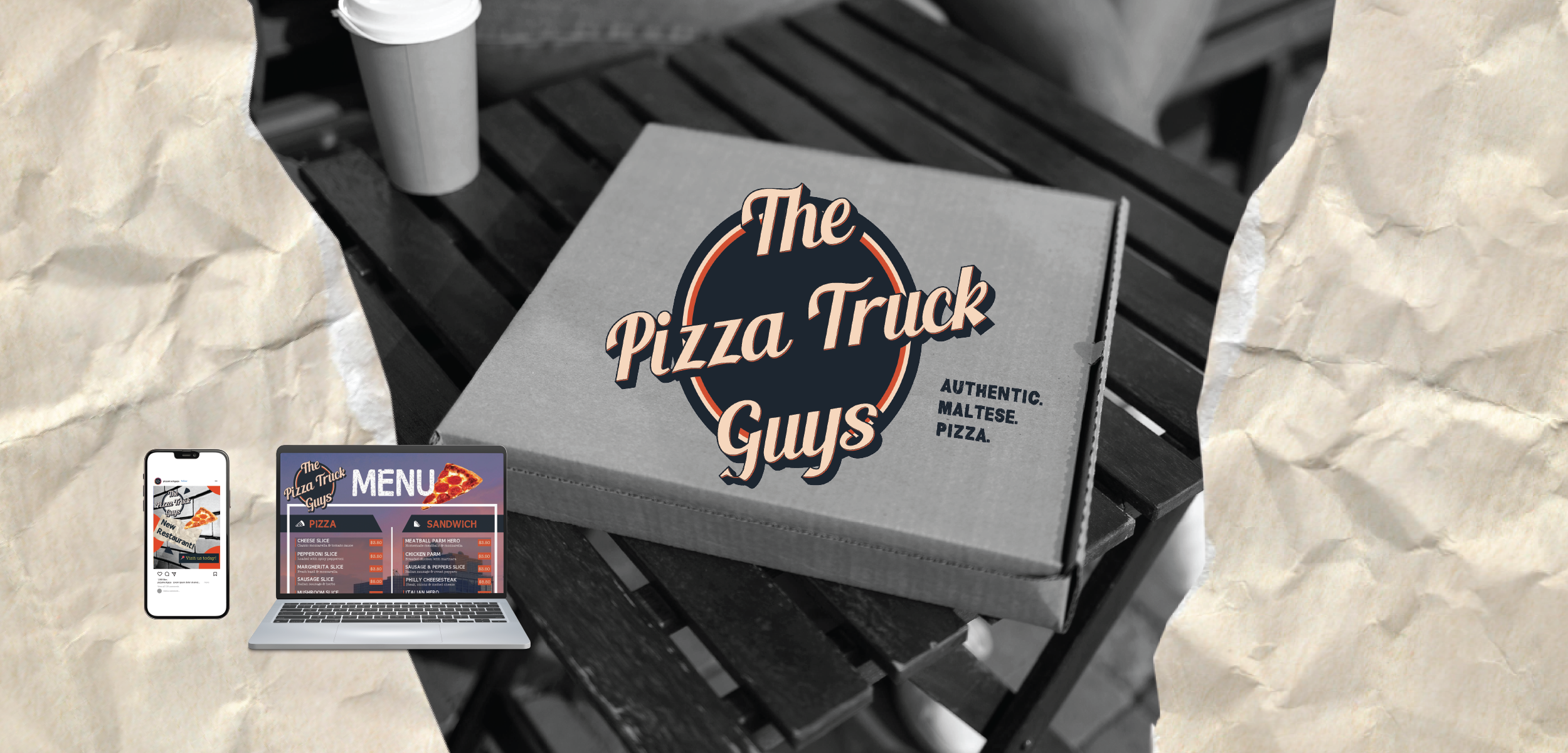
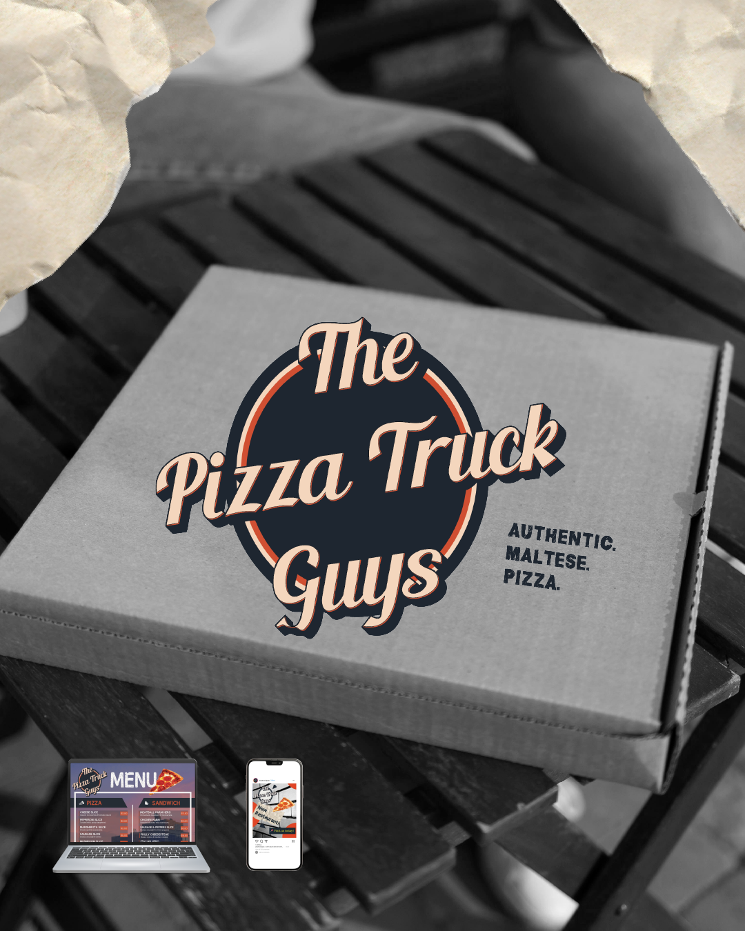
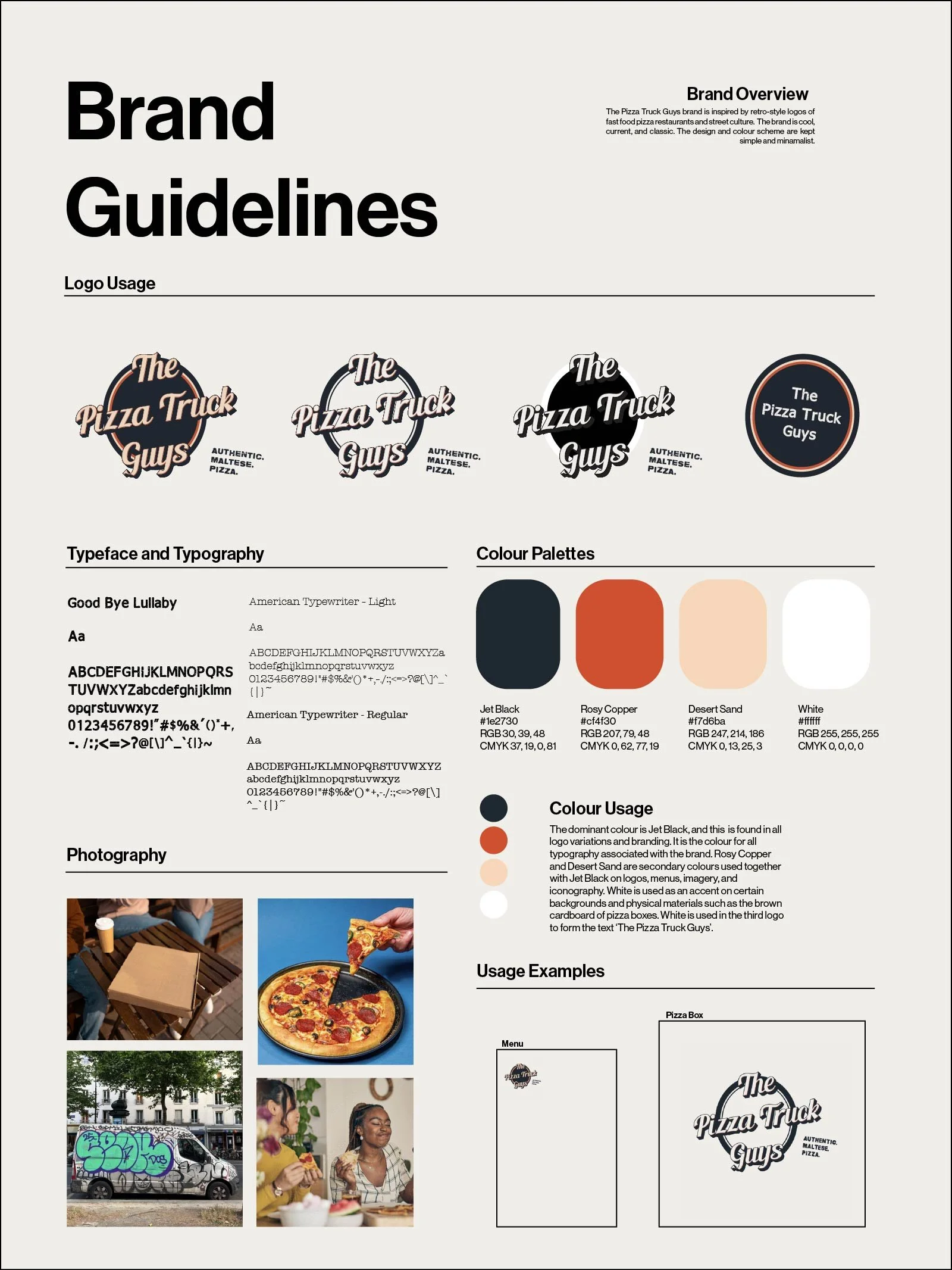
This document summarises the brand. It includes the different variations of the logo, the typography that must be used to represent the brand, the colour palette, and also gives some examples of photography and mock-ups.
MENU
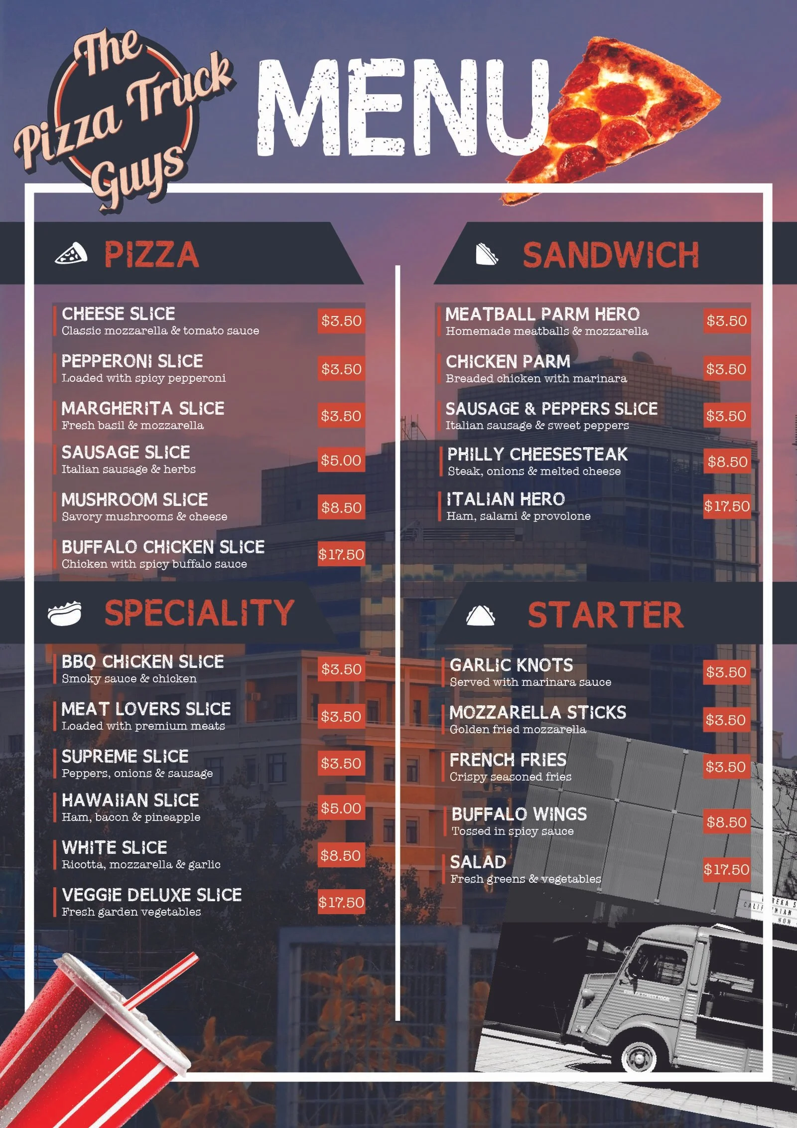
The imagery of the menu emphasises the origins of the brand, namely the city and great tasting fast food. The menu proudly shows the original pizza truck at the bottom right. The brand’s colours are on full display.
SOCIAL MEDIA
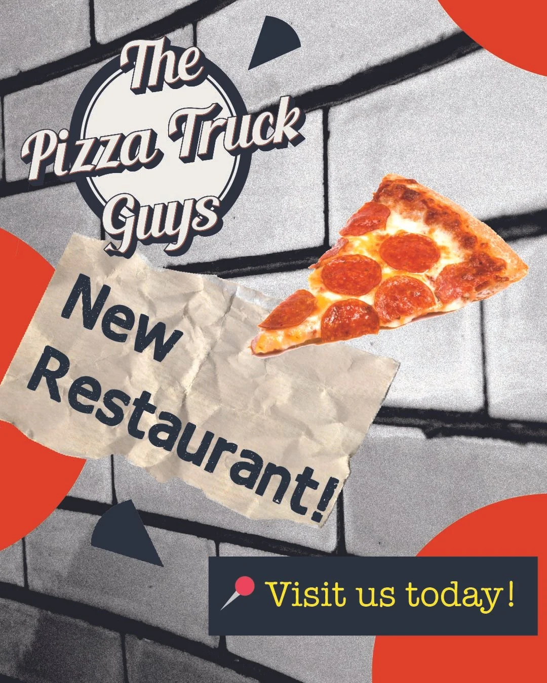
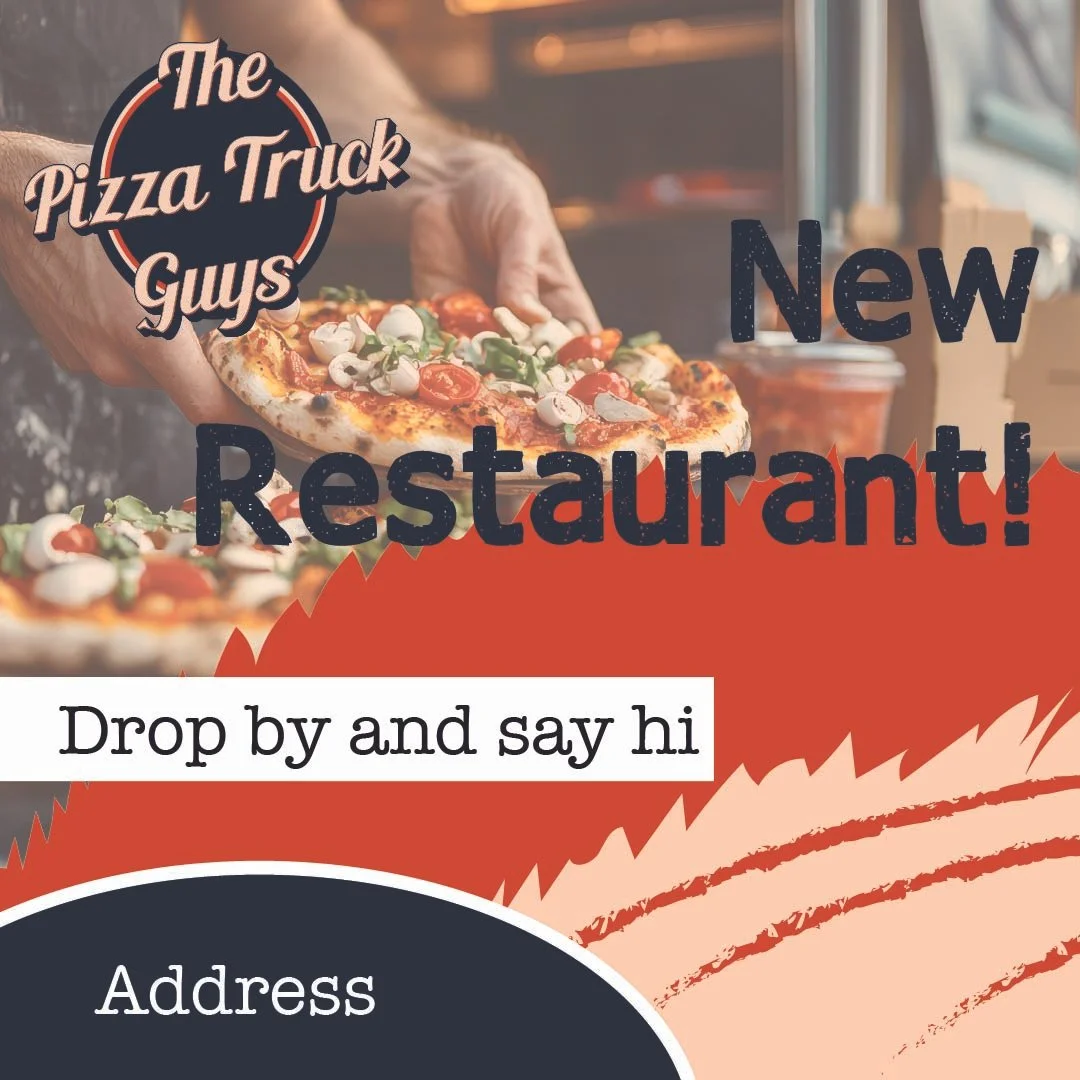
These are a couple of social media posts that are designed to build hype about the new restaurant. They are intended to look rough, human, and edgy; the story of this brand is about hard work, simplicity, and quality. And, of course, pizza - which is present in every image.
BILLBOARDS
Here you can see the logo in situ, in this case, on billboards.