Logo Development for a Web Design Project
-
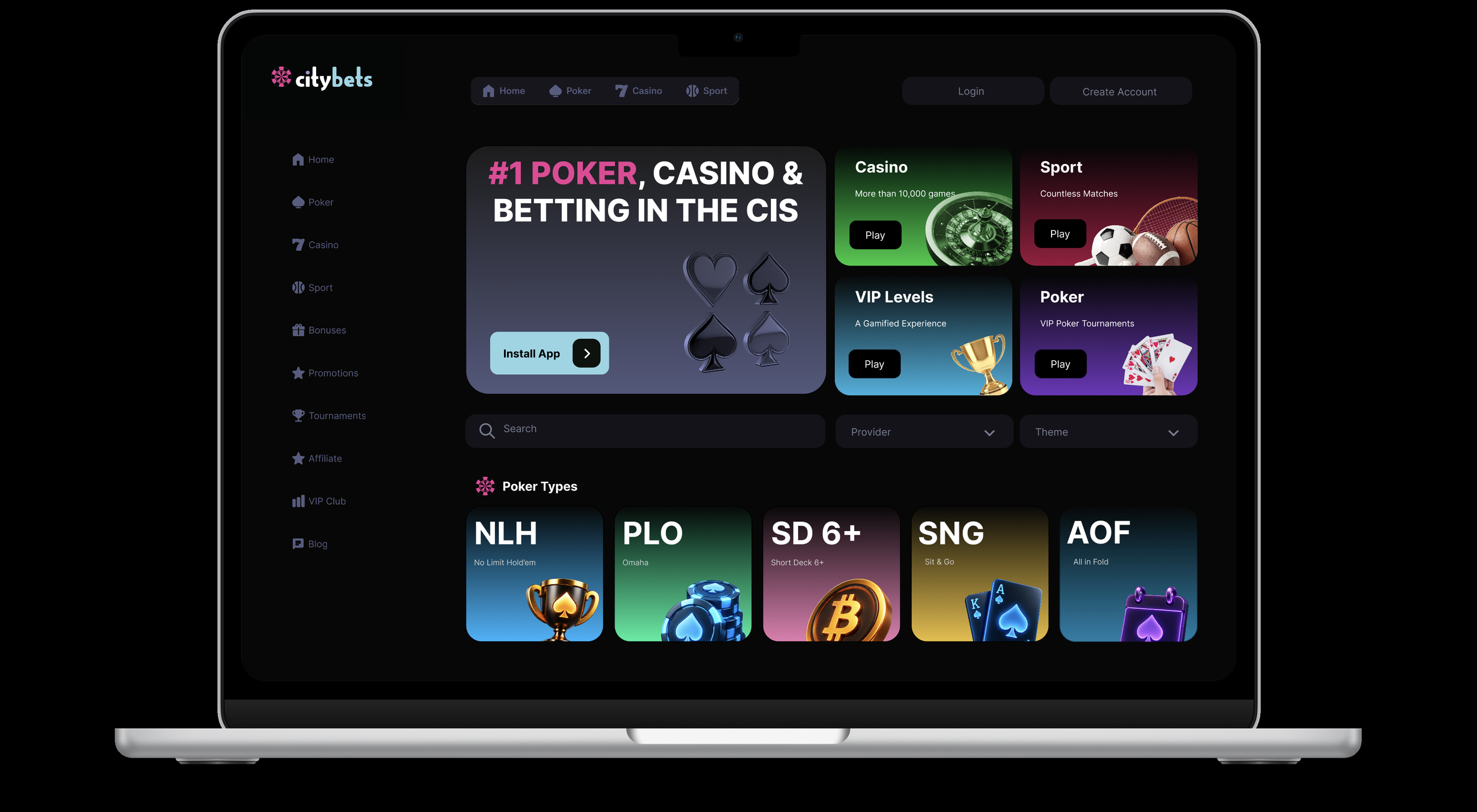
I developed a logo for an online casino brand. The logo will be used primarily on a casino website - which I designed on Figma.
-
Adobe Illustrator
Figma
-
This work started through a brainstorming exercise on pen and paper. I then transitioned to illustrator and later Figma where I built the different components with their various states (default, hover, selected) and used auto-layout to make everything fit together.
Logos:
This project will document the process by which I selected these final four logos:
Sketching My Way To The Final Logo
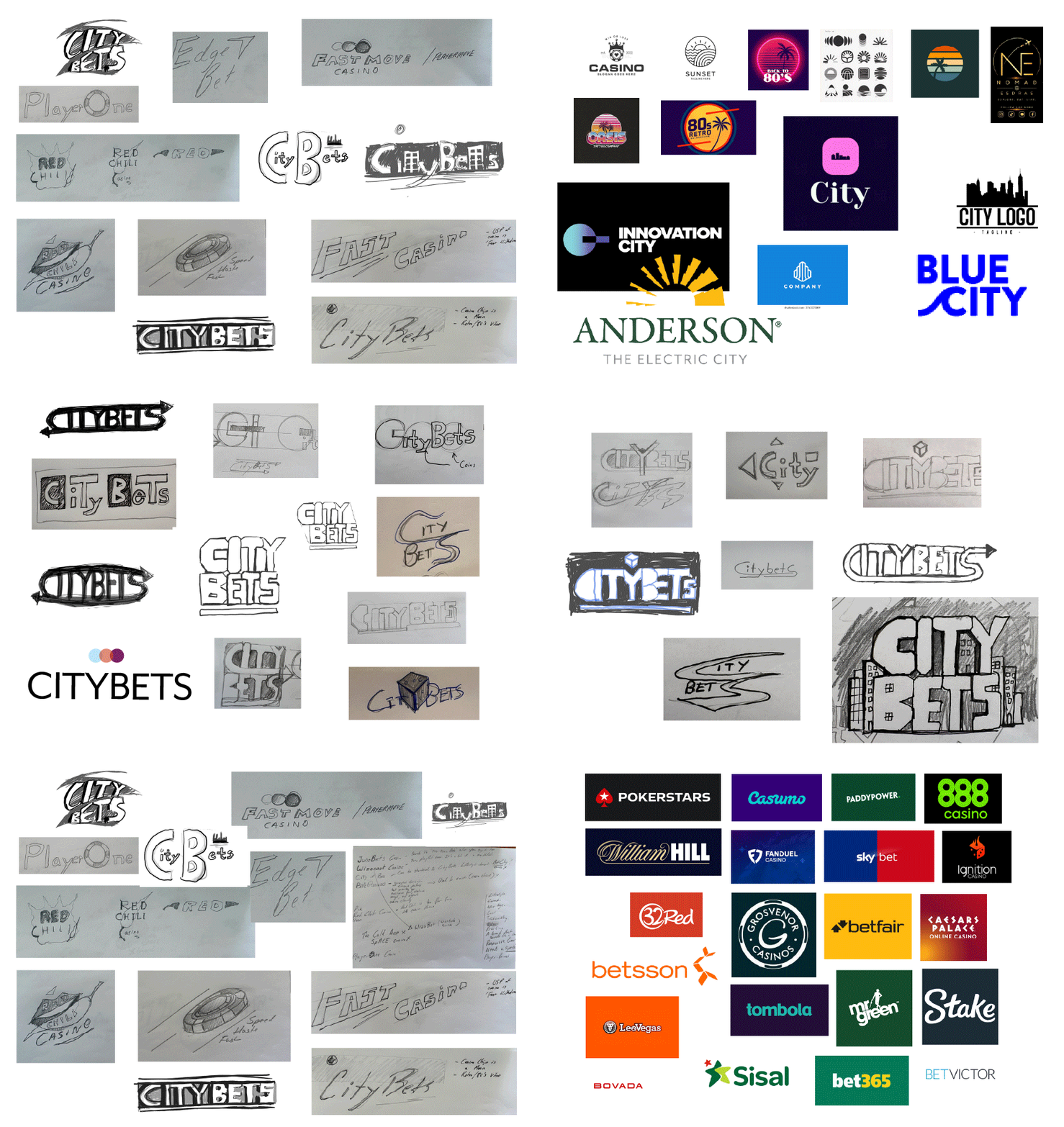
I started by taking screenshots of popular online casino logos to understand what type of logo works in the iGaming industry — common colours, type styles, and iconography.
I brainstormed different names and wrote notes. I found that I needed to define my brand before I could pick a name. In the end, I decided that the brand should be:
“Lifestyle-focussed. Current. Cool. Trustworthy.”
While coming up with different names and sketching logos, I found myself drawn to one name in particular: CityBets.
It combines an urban, current feel with a clear betting reference. It’s serious and trustworthy without sounding corporate.
Here you can see some of the prep work. I included them here to document the process.
Five Logos
If I ever felt unsure about which direction I should go in, I’d go back to the beginning and think about the established brand: “Lifestyle-focused. Current. Cool. Trustworthy.”
After brainstorming logo concepts, I eventually narrowed the list down to 5 logos:
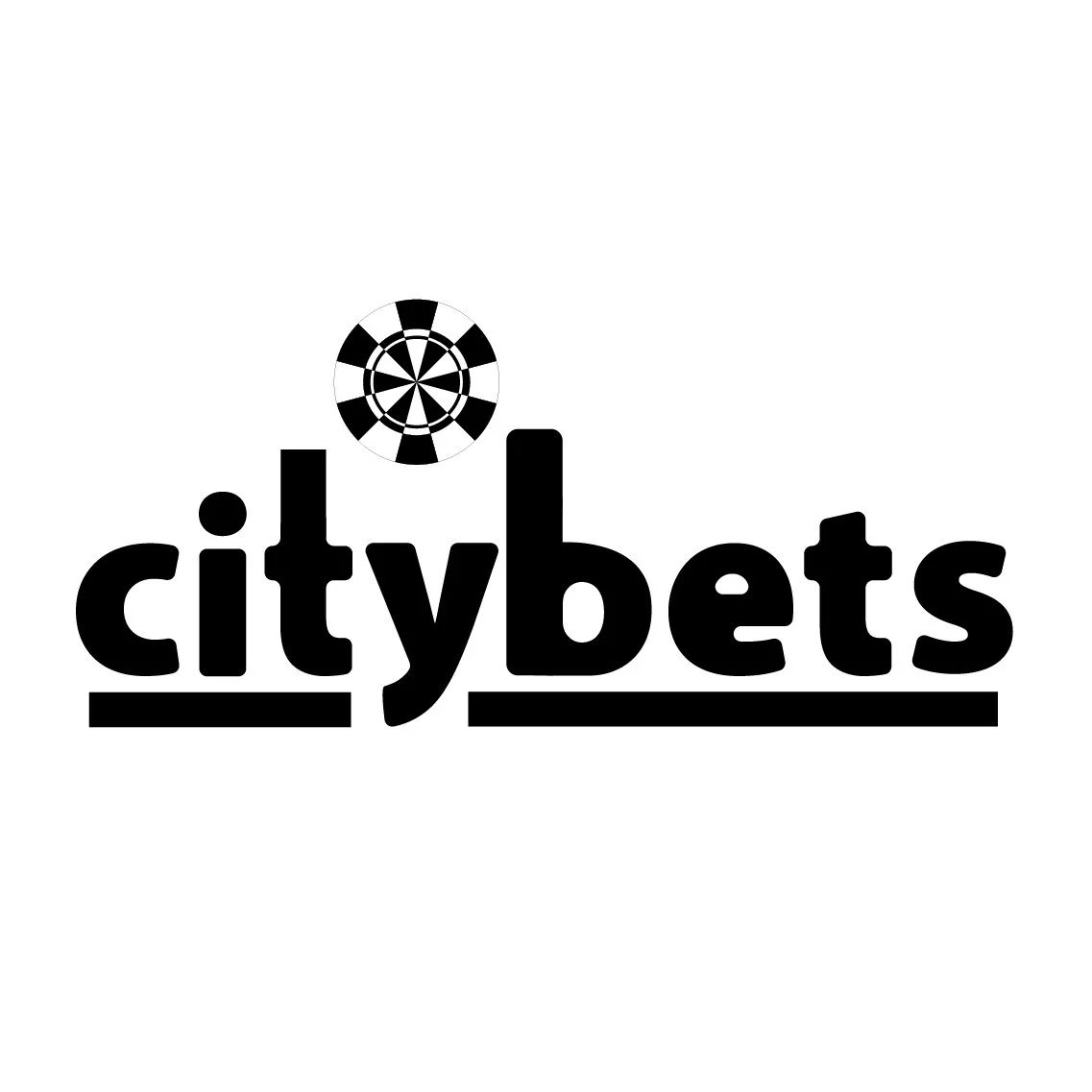
Casino chip is a sun between the ‘tower blocks’ formed by the letters b and t.

The ‘Y’ in ‘City’ becomes a dice.

A highly stylized version with a dice placed within the ‘Y’, tower blocks formed out of negative shapes, and a window placed within the ‘B’ - all urban, recognizable forms.

The casino chip is a rising sun.
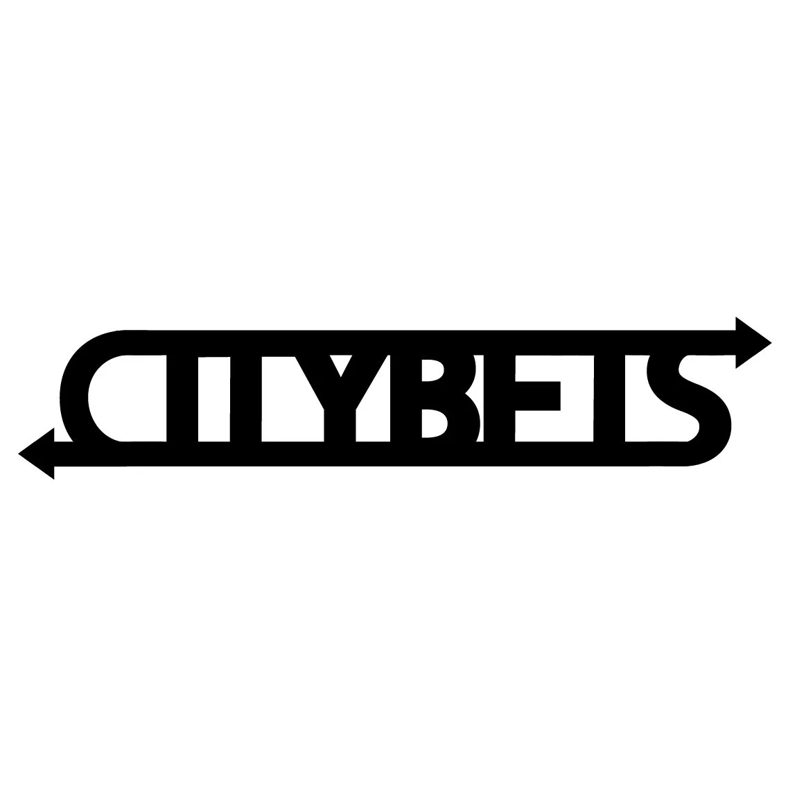
The arrows represent the circular spin button commonly seen in slot games and the shapes that are usually placed on it.
The Final Logo
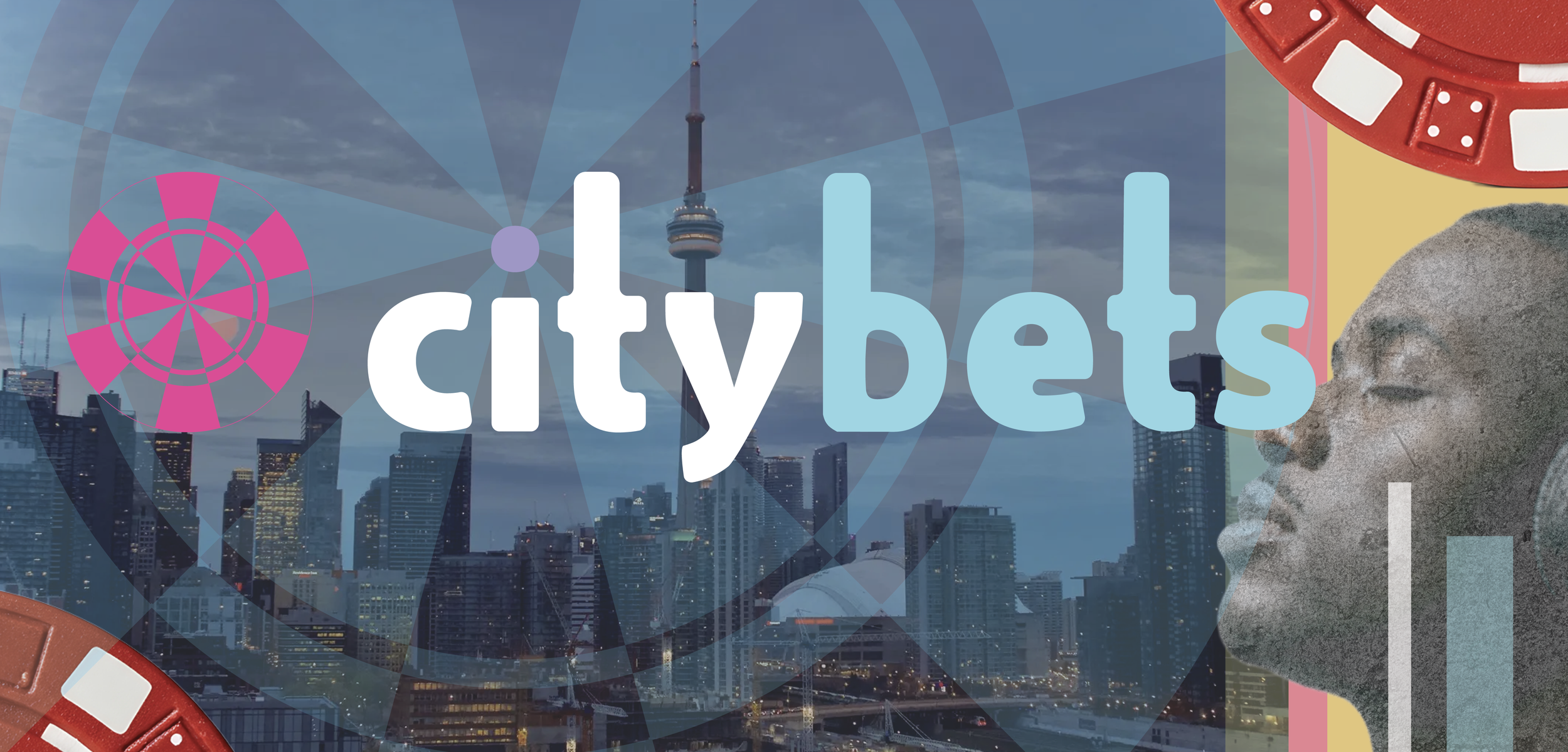
This is the final logo. I moved the casino chip and ‘citybets’ to the same horizontal plane for more uniformity. I removed the underline to make the logo simpler and more open. The font isn’t corporate — it’s cool and playful while still being respectable and trustworthy.
The font has several interesting elements which can be explored further. The elongated ‘t’ and ‘b’ form a city skyline; the casino chip can be animated to make a rising sun; the ‘e’ is reminiscent of a face that can be animated to smile and wink.
Show Your True Colours
I began experimenting with different colors. I used Adobe’s color generator but also my own instinct. I tried and tested several ideas and concepts.
The Final Colour Logos
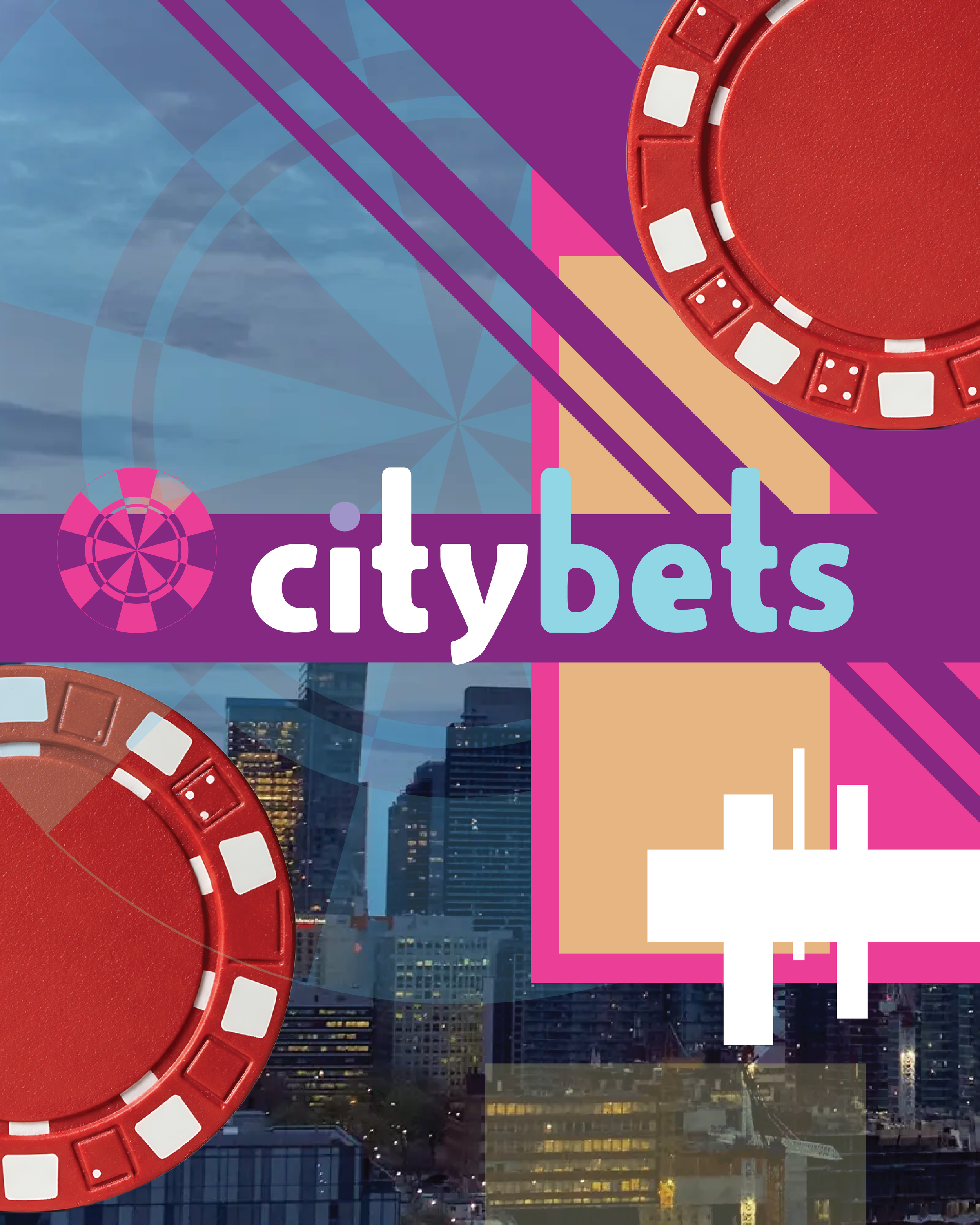
These are the two final colour logos. The pink, blue and purple are trending, fun colours - but they are somewhat muted to reflect the serious and trustworthy nature of the brand.
Hex Codes
#92d6e4
#000000
#e94097
#a096c8
#ffffff
Hex Codes
#92d6e4
#000000
#e94097
#a096c8
#ffffff
FIGMA Web Page
I designed a casino webpage using extensive components to explore how the citybets logo would look as part of an online casino experience.